Monday, April 30, 2012

An essay about Paul Rand

Wanted: Art Director with a modern, creative touch. Need not be a Rand but must be able to inspire an art department.
Classified ad in the New York Times and New York Herald Tribune, 1953 (Rand, 33).

Paul Rand
Paul Rand was an American graphic designer, whose career spanned six decades and three generations. He was born in Brooklyn, New York on August 15, 1914 with the given name Peretz Rosenbaum. Raised in an Orthodox Jewish home, Rand rebelled from his strict roots, taking up secular interests such as drawing the human form and reading comic strips. His father owned a neighborhood grocery store, which was where Rand started his career at a young age. He painted signs for his father’s store and for school events at Public School 109.
Rand took night classes at the Pratt Institute in Brooklyn while attending Manhattan’s Harren High School to satisfy his father’s demands. His father insisted that art was no way to make a living and insisted he continue in school. Rand then attended Parsons School of Design in 1932 and the Art Students League in 1933. He wanted to earn more money than his father had, so he focused on the commercial side of art. His first job was as an illustrator for Metro Associated Services, creating stock images for magazines and newspapers.
In 1935 Rand reluctantly changed his name from Peretz Rosenbaum to Paul Rand, convinced by his friends that his overtly Jewish name might be holding him back. Wyszogrod explained: “…he started looking for jobs, going from studio to studio, and they said, “What’s your name?” And he would say, “Rosenbaum.” And then they would ask, “What’s your first name?” And he was afraid to say Peretz, so he said, “Paul”. He remembered that an uncle in the family was name Rand. So he figured that “Paul Rand,” four letters here, four letters there, would create a nice symbol. So he became Paul Rand.” (Rand, 20).
After being hired as a freelancer to help produce layouts for Apparel Arts magazine, Rand’s career quickly took off. He was offered the full-time job as Art Director for Esquire Magazine at the young age of 23. His freelance work for Direction magazine, for which he exchanged a negligible fee for full artistic freedom, was an important step in the development of his style.   
Rand’s core ideology and one of his most impacting contributions to American design was the modernist philosophy. He was greatly influenced by European modern art and design and revered artists such as Paul Cezanne, Jan Tschichold, and German Bauhaus master Laslo Moholy-Nagy.  In A Designer’s Art, Rand states: “From Impressionism to Pop Art, the commonplace and even the comic strip have become ingredients for the artist’s caldron. What Cezanne did with apples, Picasso with guitars, Leger with machines, Schwitters with rubbish, and Duchamp with urinals makes it clear that revelation does not depend upon grandiose concepts. The problem of the artist is to defamiliarize the ordinary.” He exemplified this task of defamilarizing the ordinary early on through his distinguished layouts and later in making “lively and original” packaging for common objects such as lightbulbs. He explains, “ If artistic quality depended on exalted subject matter, the commercial artist, … would be in a bad way.” (Rand, 47).
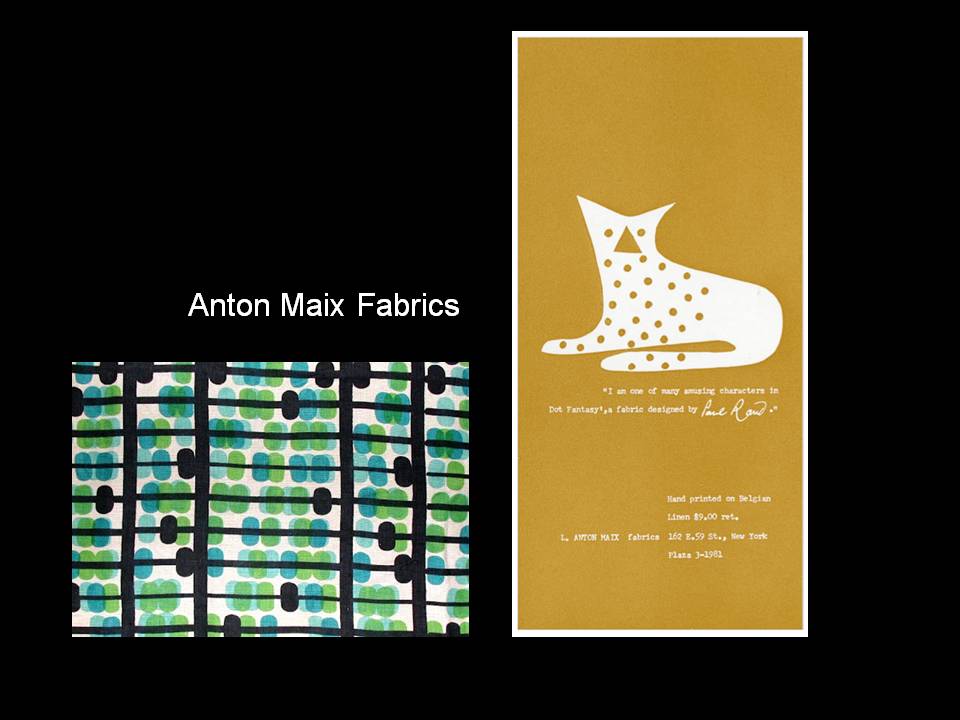
Rand was most famous for his corporate identity work in the 50’s and 60’s for major companies such as IBM, ABC, Westinghouse and UPS.  Rand’s logos epitomized the ideal of minimalism and simplicity. In his book, A Designer’s Art, Rand states that “A trademark … cannot survive unless it is designed with the utmost simplicity and restraint.” (34). He continued to develop long-lasting corporate identities and other works until his death in 1996. 


paul rand : his work from 1946 to 1958
edited by yusaku kamekura
zokeisha, tokyo
alfred a. knopf, new york 1959

paul rand: a designer's art
yale university press
new haven and london
1985

paul rand
steven heller
phaidon press limited
regent's wharf
london
1999

Thursday, April 26, 2012

Helvetica

For this project we were instructed to use the Helvetica Neue font family. This is one of my favorite fonts and widely used among designers. I suggest watching the following film to find out more about this font: Helvetica. It is a documentary about typography, graphic design and global visual font.

Link to Trailer: http://www.imdb.com/title/tt0847817/

Monday, April 16, 2012

Paul Rand

The designer that I selected is Paul Rand, an American born Graphic Designer. I chose Paul Rand because he was a very famous and talented graphic designer. He was particularly famous for his corporate identity designs. Many of these logos are still being used today. 

For the assignment, we were to prepare an informative presentation to the class about our designer. I've included the powerpoint slides below.


Thursday, April 12, 2012

Summary of Project: Wooden Vessel

This project was possibly one of the most challenging and rewarding projects of the semester. I was exposed to an area of design that I have not had much experience, which involved hands-on building and the use of powerful wood construction tools. Because of the newness and the difficulty of this project, I learned a great deal about types of wood, working with wood, using cutting tools, and the construction of a vessel.

Originally I intended to have a much larger vessel. This is one major weakness of the project. Although it can hold coffee beans, it cannot hold many. In addition, the lid does not feel on perfectly snug, which means that the vessel cannot adequately seal in the freshness. Realizing that this would be an issue from the very beginning, I intended for the vessel to hold a partially used bag of coffee beans. This is often what I am seeking to stow away. If I were to do anything differently to this piece, I would use a darker wood such as walnut. I would also make the vessel much larger and try to make the lid fit more snugly.

On the biggest strengths of my project involves not just the end result but also the process that brought me there. My initial sketches had more complex shapes and incorporated the coffee bean shape in to the middle of the vessel, as a stopper and as a handle. The curve was also much more extreme. However, I feel that editing is one of the best ways to improve a design. After getting a feel for the machines and working with the materials, I soon learned that my project design needed to be edited down.

After I cut the initial shape of the outside of the vessel, I realized that the inside design needed to allow for more space. If I had used the organic shape of the coffee bean I would not be able to utilize the entire vessel and would be limited in the amount of content it could hold. I decided to make the walls as thin as possible, while still maintaining structure. I also cut a piece from the remaining wood to be used as the stopper that would mimic the shape of the inside as well as the outside. I titled this piece in order to keep the lid more secure and to add interest to the piece.
I realize now that this piece is stronger than it would have been had I used my original design ideas. Overall, I was very satisfied with the simplicity and sleekness of my final project.

Written Reflection of The Nature & Design of Aesthetics, by David Pye

This article was an interesting read and made several notable points about a variety of subjects. I have chosen a few that were most thought provoking and noteworthy.

“We must distinguish between ‘limitations’ set by our unwillingness to incur work and trouble on the one hand, and real limitations set by our inability as workmen on the other.”

The quote above was found on the first page of the reading. I thought this was an excellent point and actually very relevant to the project we are currently working on. Often we cite that a design cannot be done, but what we really mean is that it will not be done because we are not willing to put in the time and effort. One thing I have learned about design, is the more time and the effort that I put into something, not only does the end result improve, but our satisfaction and joy from the finished work exponentially increase.

On the other hand, the article later states this: “the only considerable technical
limitation on design are imposed by our ineptitude at processing material”. This is an important point to consider in the design stage as well. Sometimes we have to realize that we do have limitations and that we might end up with a better result if we first recognize these and accept them. If we realize initially that building in a large size (greater than X dimensions) is a limitation, we can start right away in designing something smaller and have more time to explore this design and improve upon it throughout the process.

Statement of Purpose

The object(s) that I selected for this process were coffee beans. Although it may seem to be a stretch, coffee has always held a special meaning to me. While I was growing up, some of my strongest memories of being around the house were of my mother drinking coffee. She drank several pots a day: morning, noon and night. I specifically remember instances in which she would let me have a sip, and I would vow never to drink that detestable substance again.

In my first few years, I decided to give coffee another chance and soon came to enjoy the taste. Soon after, I obtained a job at a start-up coffee shop in my hometown as a barista. I worked there for the next three years, learning a lot about coffee and making friends that would become like a family.

The amazing part about this job was being able to witness on a daily basis, how a shared love for that delightful drink could bring people together.

In designing the structure for this object, I wanted to combine the organic look of a coffee bean with the more geometric structure of a wooden rectangular box. It was necessary for the inside of the object to hold as much content as possible. For this reason, my design underwent several changes. In the end, I choose a curved shape that was reflected on both sides of the vessel and
constructed thin walls that outlined the simple, elegant shape of the outside of the vessel. As a result, the vessel feels very light and the majority of the volume can be utilized to hold more coffee beans.

Written Description of Project 3: Constructing a Vessel

In this project we were to design and construct a wooden vessel that holds something important to us. After selected this special object, we designed and built a wooden box with a lid. We worked with wood sections that were 8” x 5”. The box could be anywhere from 4 to 8 inches wide.

For the construction of the vessel, we were to glue wood sections together and cut the design from this using a band saw. After cutting the shape, we used
various tools to refine and polish the vessel.

The materials used for the project included but not limited to: a band saw, wood glue, sander, sandpaper, clamps, carpet tape, polyurethane, and drawing materials.